
UI elements or user interface elements are the most integral part of a software application, regardless of whether it’s a mobile, web, desktop, or AR/VR app. UI elements are the core building blocks for all applications.
UI elements are responsible for interactions between the user and the application. They are what allows for effective user navigation and input/output data, to name but just two core functionalities.
As a UI designer (or web developer) it’s crucial to have a deep understanding of UI elements and how users interact with them. It will help you to create a better application/website structure.
In this article, we will be exploring some of the common user interface elements and UI terminologies that all designers should have a good grasp on.
Table of contents
- UI Elements & Terminology Every Designer Needs To Know
- The importance of understanding of UI elements
- Types of UI Elements
- 9 Common input elements
- 4 Common output elements
- Common helper elements
- Conclusion
UI Elements & Terminology Every Designer Needs To Know
There are some common UI elements & terminologies that are used across different platforms while designing interfaces. The three most important UI elements include:
- Input elements
- Output elements
- Helper elements
We will discuss each of these elements in detail later on in this article. As for the terminologies, we can divide them into 2 main segments.
- Standard UI terminology: Verbs (Actions Terms)
- Standard UI terminology: Nouns (Identifier Terms)
Standard UI terminology: Verbs a.k.a Actions Terms
| Terms | Description |
|---|---|
| Click / Tap | An act of pressing, tapping, touching, and releasing of a mouse button or screen touch. |
| Press | An action that requires pressing a button (physically) on the user keyboard, the power button, and so on. |
| Type | An act of pressing a key to type it into a text box, etc. |
| Swipe | Mostly applicable to touch screens. An act of touch and swipe through an area without releasing the touch. |
| Hold | An act of Click/Tap/Press and hold a UI element. Such as buttons. |
Standard UI terminology: Nouns a.k.a Identifier Terms
| Terms | Description |
|---|---|
| Field | An area in the WUI (Web User Interface) or GUI (Graphical User Interface) where you need to enter information. |
| Dialogue | A pop-up window that appears before/after an action. |
| Panel | A toolbar or a control panel. |
| Pane | An independent area in the WUI or GUI that you can scroll and resize. |
| Button | A graphical or web element that executes an action when clicked. |
| Icon | A graphical or web element that represents a shortcut to an action. |
| Tab | A graphical or web element that groups a set of actions. |
| Wizard | A dialogue that walks a user through the sequence of steps to perform a particular task. |
The importance of understanding of UI elements
Let’s say we receive a requirement of presenting the user with six options to choose from. For their preferred countries to work. Many UI elements can serve the purpose:
- List: It allows for the selection of multiple countries.
- Dropdown: This usually allows for the selection of a single element.
- Checkboxes: Alternative way for selecting none, one, or multiple countries.
- Radio: It allows for the selection of a single element.
So, what would you pick? Is there anything else that offers more value? Can you use your custom-designed radio buttons?
To resolve these questions, you require a proper understanding of various UI elements.
Interested? Let’s start!
Types of UI Elements
Ideally, we can group UI elements into 3 major categories.
- Input elements
- Output elements
- Helper elements
Input elements
Input elements are responsible for handling different user inputs. Sometimes they’re also part of the input validation process. Some of the most used input elements include:
- Dropdowns
- Combo boxes
- Buttons
- Toggles
- Text/password fields
- Date pickers
- Checkboxes
- Radio buttons
- Confirmation dialogues
Output elements
Output elements are responsible for showing results against various user inputs. They also show alerts, warnings, success, and error messages to the users. Output elements aren’t neutral by nature. They rely on inputs and various operations.
Helper elements
All other elements fall into this category. The most widely-used helper elements include:
- Notifications
- Breadcrumbs
- Icons
- Sliders
- Notifications
- Progress bars
- Tooltips
We can also group helper elements into 3 categories.
Navigational
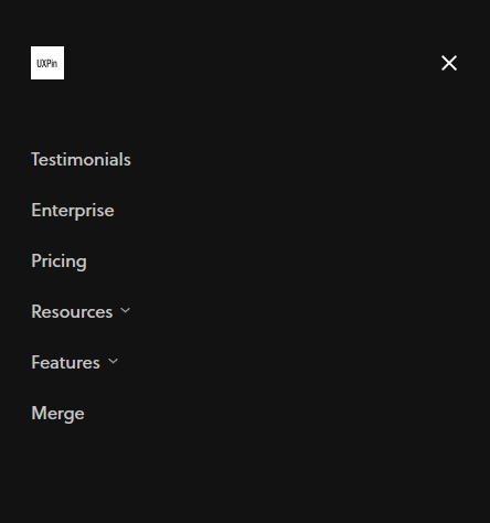
Responsible for UI navigation. Navigational helper elements include things like navigation menus, list of links, and breadcrumbs, to name but a few.
Source: UXPin
Informational
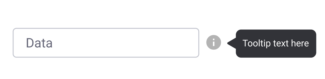
Responsible for representing information. These include, for example, tooltips, icons, and progress bars.

Source: Toptal
Groups/containers
Responsible for holding various components together. Widgets, containers, and sidebars for part of this category. The Newsletter subscription widget of UXPin blog is also a good example of a container.

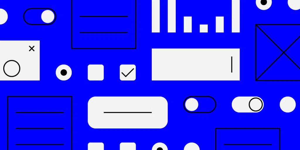
9 Common input elements
-
Checkboxes
Checkboxes allow the user to select one or more options from an option set. It is best practice to display checkboxes vertically. Multi-columns are also acceptable considering the available space and other factors.
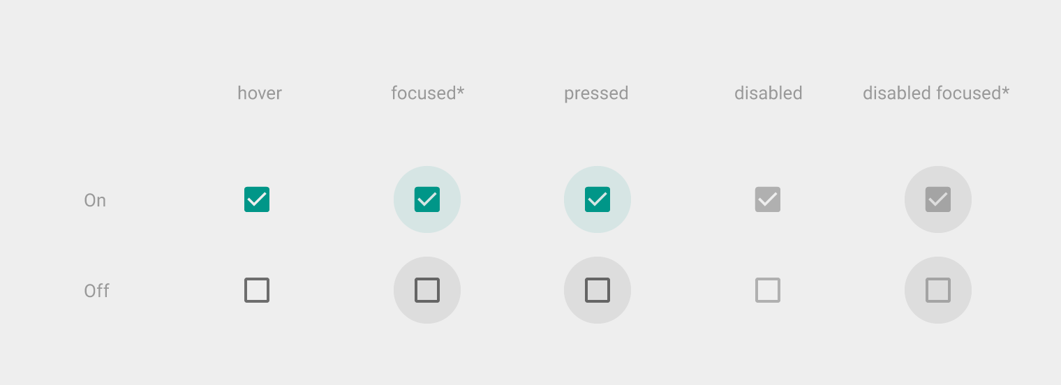
Source: Github.com
-
Dropdowns
Dropdowns allow users to select one item at a time from a long list of options. They are more compact than radio buttons. They also allow you to save space. For better UX, it’s necessary to add a label and a helper text as a placeholder. I.e. “Select One, Choose, etc.”
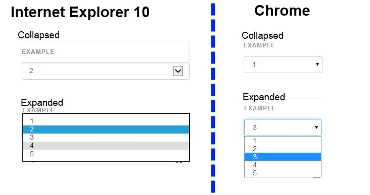
Source: Stackoverflow
-
Combo boxes
Combo boxes allow users to either type a custom value directly or select a value from the list. It is a combination of a drop-down list or list box and a single-line input field.
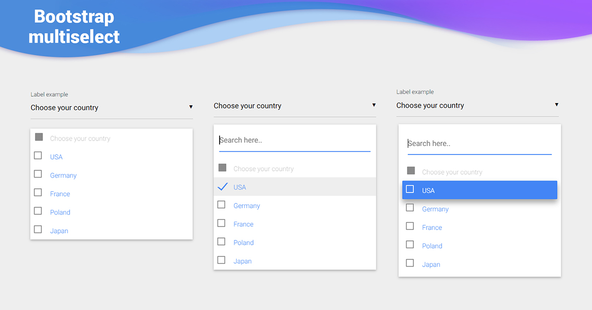
Source: mdbootstrap
-
Buttons
Buttons allow the users to perform an action with touch or click. It is typically labelled with text, icon, or both. Buttons are one of the most important parts of a UI. So it’s important to design a button that the user will actually click.
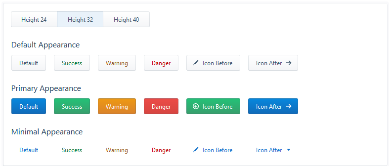
Source: Evergreen UI
-
Toggles
Toggles allow the user to change a view/value/setting between two states. They are useful for toggle between on and off state or switching between list view and grid view.
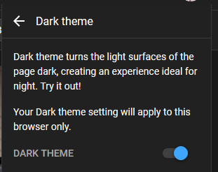
Source: Youtube
-
Text/password fields
Text fields and password fields allow users to enter text and password respectively. Text fields allow both single-line and multi-line inputs. Multi-line input fields are also known as “textarea”. Password fields generally allow single lines for a password.
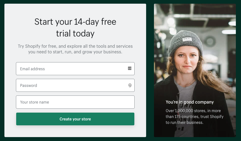
Source: Shopify.com
-
Date pickers
A date picker allows users to pick a date and/or time. By using a native date picker from the platform, a consistent date value is submitted to the system.
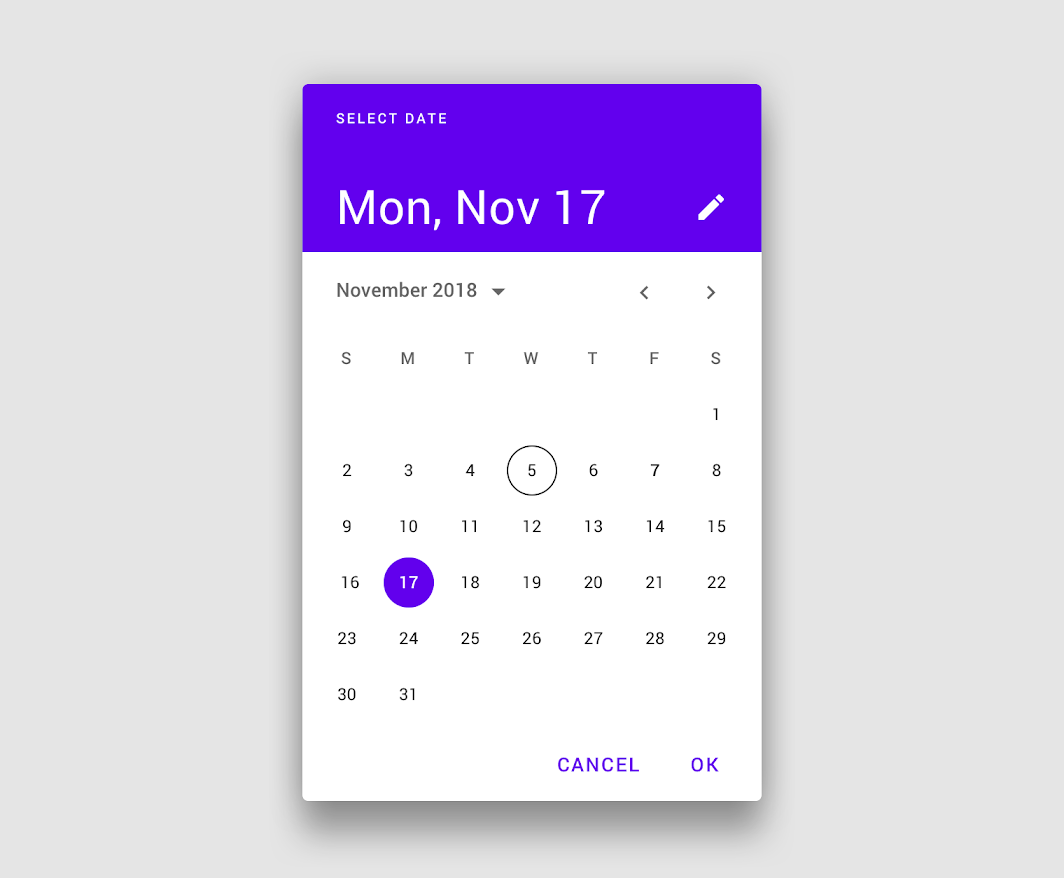
Source: Material Design
-
Radio buttons
Radio buttons allow users to select only one of a predefined set of mutually exclusive options. A general use case of radio buttons is selecting the gender option in sign-up forms.
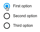
Source: UXPin
-
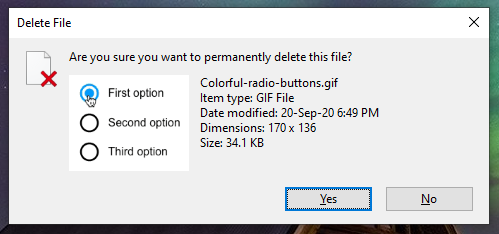
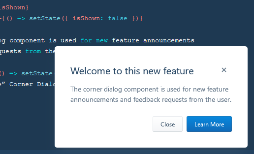
Confirmation dialogues
Confirmation dialogues are responsible for collecting user consent for a particular action. For example, collecting user consent for a delete action.
4 Common output elements
-
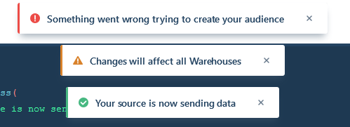
Alert
An alert presents a short, important message that attracts the user’s attention. It notifies users about these statuses and outputs.

Source: material-ui.com
-
Toast
This refers to a UI feature where an event (user input, server response, calculation etc.) triggers a small text box to appear on the screen. Ideally, it appears at the bottom on mobile and bottom left or right side on the desktop.
The difference between “Alert” & “Toast” is that the former doesn’t dismiss itself and the latter does after a certain time.
-
Badge
This feature generates a small badge to the top-right of its child(ren). In general, it represents a small counter or indicator. This can be something like the number of items over the cart icon or online indicator over a user avatar.

-
Charts
Charts are a common way of expressing complex data sets because they depict different data varieties & data comparisons.
The type of chart used in UI depends primarily on two things: the data we want to communicate, and what we want to convey about that data
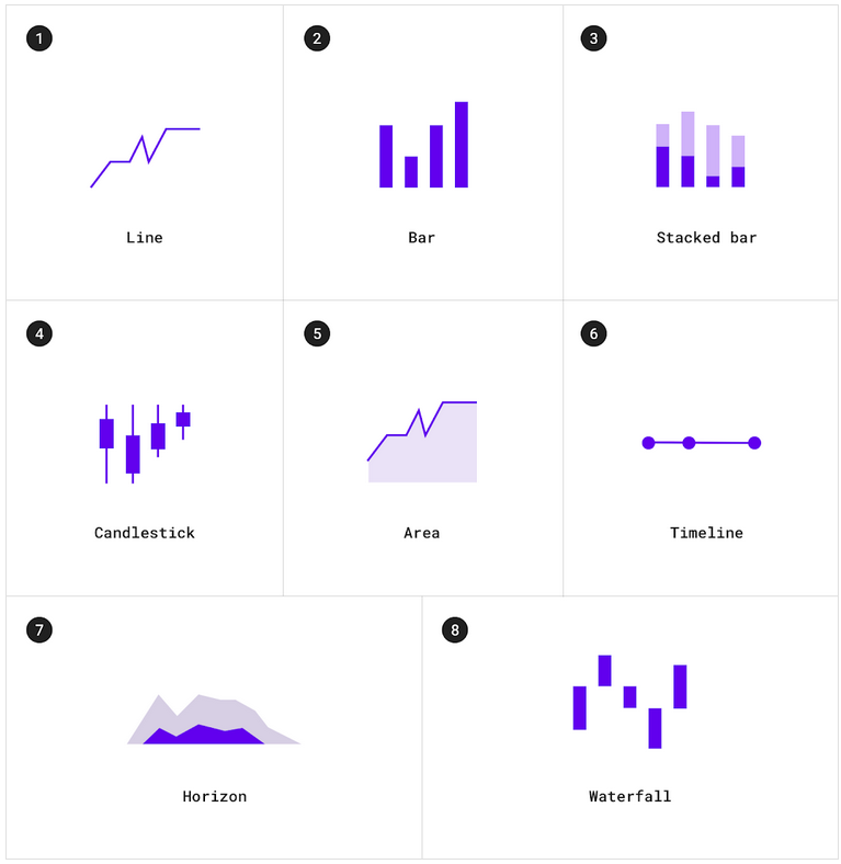
Different types of charts. Source: material.io
Common helper elements
I. Navigational
-
Navigation menus
This is a UI element with several values that the user can select. They are taken to another area of the website/app from there.
Source: UXPin
-
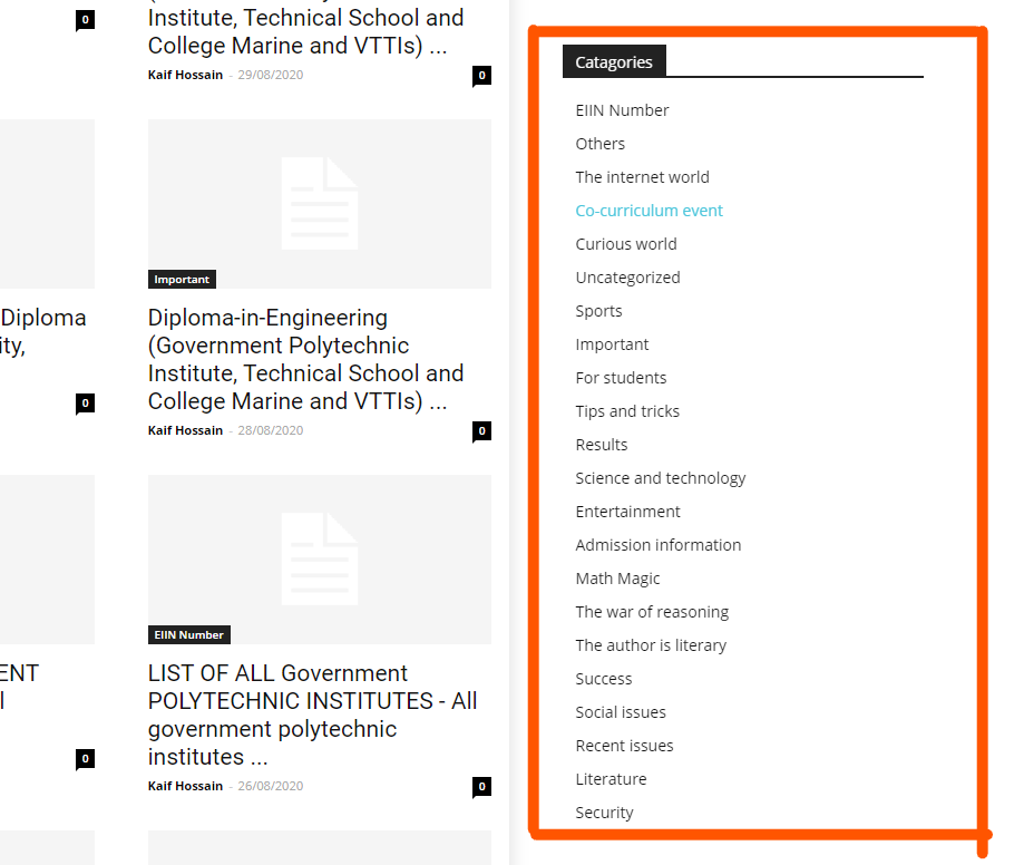
List of links
As the name suggests, a list of links consists of links. Sidebar with a category list is a good example of this. Links can be both internal and external.
-
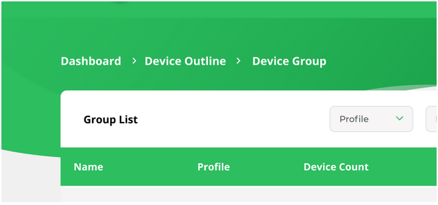
Breadcrumbs
Breadcrumbs allow users to see their current location within the system. It provides a clickable trail of proceeding pages to navigate with.
-
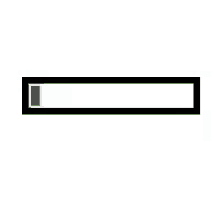
Search fields
A search bar is usually made up of two UI elements: an input field and a button. It allows users to enter a keyword and submit it to the system expecting the most relevant results.

Source: Google Chrome Browser
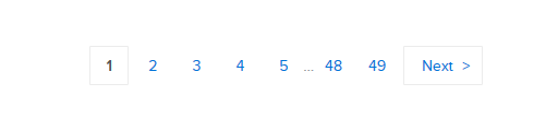
-
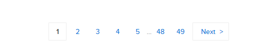
Paginations
This feature divides the content between pages and allows users to navigate between them.
II. Informational
-
Tooltips
A tooltip shows users hints when they hover over an element indicating the name or purpose of the item.
-
Icons
It’s a simplified symbol that is used to help users to navigate the system, presenting the information and indicating statutes.
Source: Dribbble
-
Progress bars
A progress bar indicates the progress of a process. Typically, progress bars are not clickable.
Source: Tenor
-
Notifications
It is an update indicator that announces something new for the user to check. Typically shows completion of a task, new items to check etc.
-
Message boxes
It’s a small window that provides information to users but typically doesn’t prevent users from continuing tasks. Message boxes perform tasks like showing warnings, suggestions, etc.
Source: Evergreen UI
-
Modal windows
It’s used to show content on top of an overlay. It blocks any interaction with the page — until the overlay is clicked, or a close action is triggered.
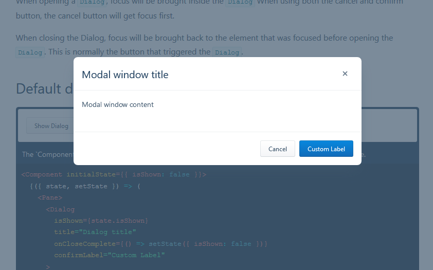
Source: Evergreen UI
IV.Group/containers
-
Widgets
It’s an element of interaction, like a chat window, components of a dashboard, or embeds of other services.
Source: Dribbble.com
-
containers
containers hold different components together. This includes text, images, rich media etc. Cards in modern UI design are one of the best examples of containers.
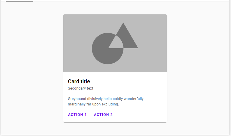
Source: Material.io
-
Sidebars
Sidebars also contain other groups of elements and components. But that can be switched between collapse and visible state.
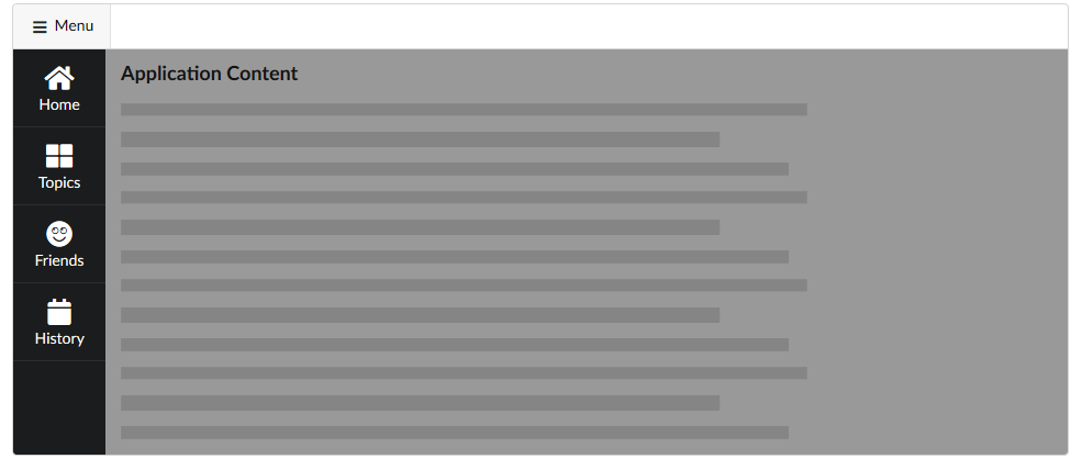
Source: Semantic-UI
-
Search bar
The search bar holds the search field and search options. Typically, the search bar features a search field and filtering option. Twitter’s advanced search is a great example.
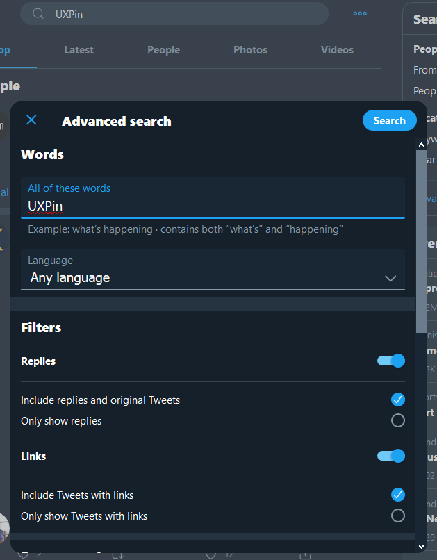
Source: Twitter
Conclusion
In this article, we’ve covered the importance of understanding UI elements and how users interact with them. From input to output and helper elements, we’ve discussed all the terminology you need to grasp as a developer to design and keep your UI elements organized and working efficiently.
Now that you understand what common UI elements are and how they work, it’s time to put your new knowledge to practice. UXPin offers all the features you need to design and organize your UI elements, simplifying the process of designing and prototyping with powerful features!
Get started now. You don’t even need a credit card number to explore UXPin’s powerful features.
This article was initially written for Studio by UXPin as a ghostwriting contract. All copyrights: UXPin Studio