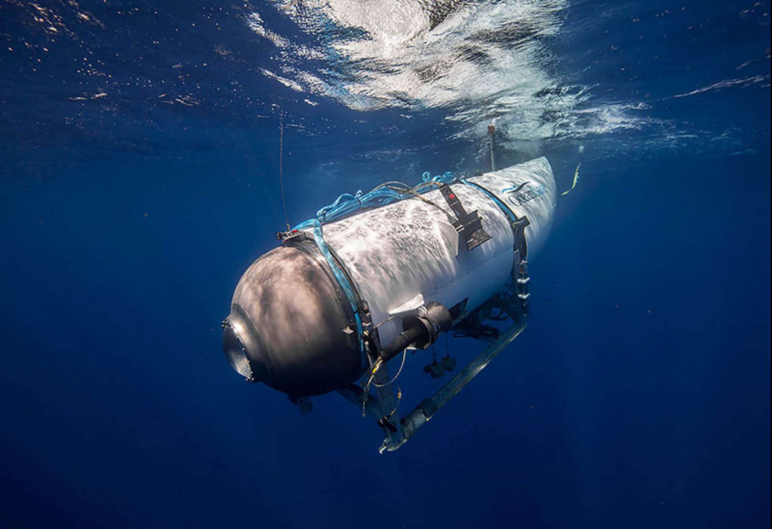
The OceanGate Titan was a submersible that was supposed to explore the wreck of the Titanic, but it ended up being a death trap for its crew. The submersible imploded at a depth of 3,800 meters, killing all five people on board. The cause of the accident was traced to the poor design and construction of the submersible, which used cheap and inadequate materials and skipped crucial safety checks. This tragic incident has some important lessons for UX designers, who are responsible for creating products that are not only functional and attractive, but also safe and reliable.
Simple isn’t always better
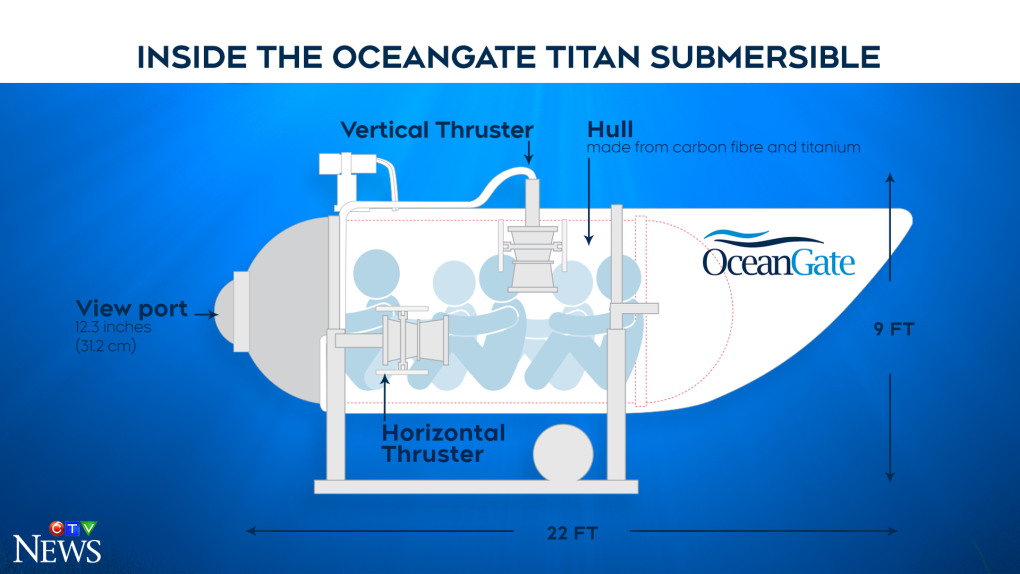
One of the main design flaws of the OceanGate Titan was its pressure hull, which was made of carbon fiber instead of steel. Carbon fiber is lighter and cheaper than steel, but it is also more brittle and prone to cracking under high pressure. The OceanGate team claimed that they had tested the hull extensively, but they did not follow the industry standards or get any certification from independent authorities. They also ignored the warnings from experts who advised them to use steel instead.
 (Image Source: CTVNews)
The OceanGate team chose simplicity over safety, which proved to be a fatal mistake. As UX designers, we should always consider the trade-offs between simplicity and safety, especially when designing products that involve high-risk scenarios or environments.
Simplicity is not an excuse to compromise on quality or reliability.
We should use the best materials and technologies available, and follow the best practices and standards in our field. We should also seek feedback and validation from experts and users, and not rely on our own assumptions or opinions.
Moving fast and breaking things is not an option
Another design flaw of the OceanGate Titan was its control and communication system, which was based on a game controller. The OceanGate team claimed that they wanted to make the submersible easy to operate and accessible to anyone, but they also admitted that they had developed the system in a hurry, without any proper testing or debugging. The system was unreliable and prone to glitches, which made it difficult for the crew to communicate with the surface or control the submersible. The system also lacked any backup or emergency features, which left the crew helpless when the submersible started to malfunction.
 (Image source: The Times of India)
The OceanGate team followed the motto of “moving fast and breaking things”, which is popular among some startups and tech companies. However, this motto is not suitable for designing critical products that involve human lives or safety.
Moving fast and breaking things may work for creating prototypes or experiments, but not for creating final products that are meant to be used by real people in real situations.
As UX designers, we should always prioritize safety over speed, and test our products thoroughly before releasing them to the public. We should also design our products with contingency plans and fail-safe mechanisms, in case something goes wrong.
The OceanGate Titan disaster is a sad reminder of the importance of safety in design. As UX designers, we should learn from this tragedy and avoid making the same mistakes. We should always put safety first, and use the best materials and methods available. We should also test our products rigorously and get feedback from experts and users. By doing so, we can create products that are not only useful and beautiful, but also safe and trustworthy.

