
Have you ever noticed those little red circles with numbers popping up on your app icons? Those are called badge notifications, and they’re a powerful (and sometimes controversial) element in UX design. Let’s dive into why they exist and how they impact our brains.
What are Red Badge Notifications?

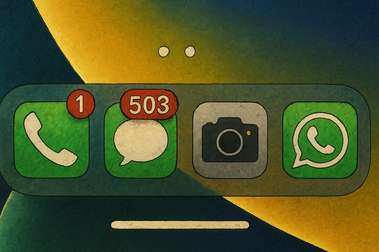
Hey, there’s something new you haven’t seen yet!.
The Power of the Color Red
The choice of red for these badges isn’t random. Psychologically, red is a color strongly linked to danger and urgency. Think of stop signs or emergency alerts. Our brains have an innate reaction to red, making us take notice immediately. UX designers leverage this powerful association to ensure that these notifications grab your attention and prompt you to act.
There are real science and strategy of color selection in UI Design.

The Role of the Circle
Beyond the color, the circular shape itself plays a role. Circles are visually pleasing and easy for our brains to process, naturally guiding our eyes towards the center. This smooth flow helps you quickly spot the notification and understand where the new information is located.
Cognitive Biases at Play
The effectiveness of red badge notifications goes beyond just being visually noticeable. They tap into some fundamental ways our brains work, specifically triggering cognitive biases. Here are the two main ones:
Salience Bias:
This bias means we tend to focus on things that stand out more while ignoring less noticeable things. A red badge on an app icon instantly makes it more visually prominent and relevant compared to other apps without badges. Even if it’s not the most important app at that moment, its visual prominence can draw your attention.
Urgency Bias:
This bias describes our tendency to prioritize unimportant tasks over important ones simply because the unimportant tasks create a false sense of urgency. The red badge can create this feeling of urgency, suggesting unfinished business that needs your immediate attention. You might find yourself clicking on an app just to clear the badge, even if you weren’t planning to use it. These biases often work on what’s known as “System 1” thinking – the fast, intuitive, and emotional part of our brain – leading you to click without much conscious thought.
Why Designers Use Them
From a designer’s perspective, red badge notifications can be quite effective:
- Increased User Engagement and Clicks: Studies have shown a significant increase in clicks on apps with badge notifications. This means users are more likely to return to the app when they see a badge.
- Enhanced Visibility and Relevance: The red badge makes the app instantly more noticeable and relevant due to the salience bias.
- Prompting Immediate Action: The urgency associated with the red color and the notification itself can compel users to open the app and address the updates.
- Navigational Beacon: Badges can act as a guide, pointing users to new content or updates within the app.
The Downsides for Users
While effective for engagement, red badge notifications can also have negative impacts on users:
- Overwhelm and Distraction: A screen full of red badges can feel overwhelming and lead to a negative user experience. Notifications, in general, are designed to interrupt our current activity, causing distraction.
- Manipulation through Pseudo-Notifications: Companies might use “pseudo-notifications” – fake notifications that aren’t genuine alerts but rather marketing messages or prompts to re-engage with the app. This can feel manipulative.
- Notification Fatigue: The constant stream of notifications can lead to users becoming desensitized or annoyed, potentially causing them to use the app less or disable notifications altogether.
- Negative Feelings and Anxiety: Users may feel obligated to tap on a badged icon just to clear it, even if they’re not interested. The red color itself can sometimes be alarming and contribute to feelings of being overwhelmed.
Ethical Considerations and Dark Patterns
The use of red badge notifications, especially when employed manipulatively, raises ethical concerns. A “dark pattern” is a design feature intended to deceive or trick users into taking an action they didn’t intend. Pseudo-notifications and making it difficult to disable notifications can be considered dark patterns.