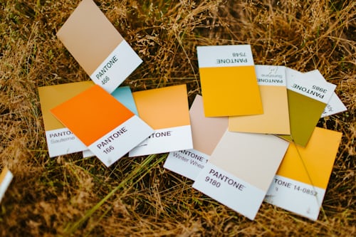
Colors play a crucial role in shaping the user experience in digital interfaces. The right color choices can evoke emotions, guide users’ attention, and help create a harmonious visual flow. As a result, selecting the perfect color palette is a vital aspect of user interface (UI) design. In this article, we will explore the 10 most used colors in UI design, delving into their history, psychological effects, and unique details.
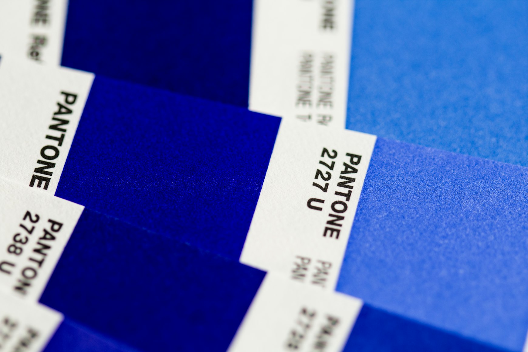
Understanding the significance of each color will not only enhance your appreciation of their role in UI design but also provide you with the knowledge to make informed decisions when incorporating them into your own projects. So, let’s embark on a colorful journey through the world of UI design and discover the stories behind these ten powerful hues.
Color 1: Red

- Features: Red is a bold and dynamic color that demands attention. In UI design, it’s often used for error messages, warnings, and critical actions such as deleting or removing content. Additionally, red is commonly used for call-to-action buttons, which require users’ immediate attention.
- Advantages: The history of red dates back to prehistoric times when it was one of the first colors used in art and symbolism. Red has long been associated with power, passion, and energy. Its high visibility and strong psychological impact make it an excellent choice for conveying urgency and importance in UI design.
- Benefits: Psychologically, red triggers excitement, alertness, and a sense of urgency. When used effectively, it can guide users to take specific actions and improve the overall user experience. However, it’s crucial to use red sparingly and thoughtfully, as excessive usage can create stress and discomfort for users.
Color 2: Blue

- Features: Blue is a versatile and calming color frequently used in UI design. It’s often associated with trust, reliability, and professionalism. As a result, blue is a popular choice for backgrounds, navigation bars, and buttons, particularly in corporate and financial applications.
- Advantages: Blue has a rich history and has been widely used in various cultures for centuries. It’s often connected to the sky and water, symbolizing stability, tranquility, and depth. In UI design, blue’s widespread appeal and positive connotations make it a safe and reliable choice for creating a sense of trust and credibility.
- Benefits: Psychologically, blue is known to induce feelings of calmness, security, and mental focus. Its soothing nature can help reduce stress and create a comfortable user experience. Blue’s ability to convey reliability and trustworthiness makes it an ideal color for platforms that require users to share personal information or engage in financial transactions.
Color 3: Green
- Features: Green is an inviting and refreshing color that represents growth, harmony, and balance. In UI design, it’s often used to signify success, positive actions, and environmental themes. Green is also a popular choice for buttons that initiate downloads or signify completion of a task.
- Advantages: The history of green stretches back to ancient times, where it was associated with nature, fertility, and renewal. Today, green still maintains its connection to the natural world and represents sustainability, eco-friendliness, and organic growth. In UI design, green can create a sense of reassurance and encourage users to feel confident in their actions.
- Benefits: Green is known to evoke feelings of relaxation, growth, and optimism. Its positive psychological effects make it an excellent color for promoting user satisfaction and motivation. When used thoughtfully, green can create a sense of harmony and balance, improving the overall user experience and fostering a positive connection with a brand or platform.
Color 4: Yellow

- Features: Yellow is a vibrant and energetic color that instantly catches the eye. In UI design, it’s often used for notifications, warnings, and highlighting essential information. Yellow can also be utilized to add a sense of warmth and friendliness to a user interface.
- Advantages: Yellow has been associated with the sun, light, and warmth since ancient times. It symbolizes happiness, optimism, and enlightenment. In UI design, yellow’s attention-grabbing quality makes it perfect for drawing users’ focus to specific elements or creating a sense of urgency.
- Benefits: Psychologically, yellow can stimulate mental activity, encourage communication, and evoke feelings of joy. However, it’s crucial to use yellow carefully, as excessive use or overly bright shades can create visual fatigue and anxiety. When used appropriately, yellow can create a positive and engaging user experience.
Color 5: Orange

- Features: Orange is a lively and energetic color that combines the warmth of red with the cheerfulness of yellow. In UI design, it’s commonly used for call-to-action buttons, progress indicators, and attention-grabbing elements that encourage user interaction.
- Advantages: Historically, orange has been associated with creativity, enthusiasm, and warmth. It’s an attention-grabbing color that can effectively convey a sense of fun and excitement. In UI design, orange can be used to create a sense of urgency without the potential negative connotations of red.
- Benefits: Orange has been shown to stimulate feelings of excitement, enthusiasm, and warmth, making it an excellent color for creating an engaging and friendly user experience. When used strategically, orange can help guide users through an interface and encourage them to take desired actions.
Color 6: Purple

- Features: Purple is a sophisticated and enigmatic color that represents luxury, creativity, and spirituality. In UI design, it’s often used to create a sense of elegance and richness, making it an ideal choice for high-end brands or platforms focused on art and creativity.
- Advantages: Purple has long been associated with royalty, wealth, and wisdom, dating back to ancient civilizations. It’s a unique and powerful color that can help set a brand or platform apart from its competitors. In UI design, purple can be used to create a sense of exclusivity and sophistication.
- Benefits: Psychologically, purple has been linked to feelings of calmness, creativity, and inspiration. It can help foster a sense of luxury and distinction, which can be particularly beneficial for platforms aimed at a high-end audience or those that focus on artistic expression. By incorporating purple into a user interface, designers can create an immersive and memorable experience for users.
Color 7: Gray
- Features: Gray is a neutral and versatile color that can be used in various shades to create balance and sophistication in UI design. It’s often employed for backgrounds, text, borders, and other subtle elements that support the overall visual hierarchy without being too overpowering.
- Advantages: Gray has been associated with practicality, stability, and professionalism throughout history. In UI design, gray’s neutrality makes it an excellent choice for creating contrast, emphasizing other colors, and maintaining a clean, modern aesthetic.
- Benefits: Psychologically, gray is calming and unobtrusive, creating a sense of balance and stability. It can help reduce visual clutter and support a seamless user experience. When used effectively, gray can provide a solid foundation for a design, allowing more vibrant colors to take center stage and guide users through an interface.
Color 8: White

- Features: White is a clean and minimalistic color that represents purity, simplicity, and openness. In UI design, white is often used for backgrounds, text, and negative space to create a sense of clarity and airiness.
- Advantages: White has been associated with cleanliness, innocence, and simplicity since ancient times. In UI design, white’s uncluttered appearance makes it perfect for creating a sense of space and highlighting other colors or visual elements.
- Benefits: Psychologically, white can evoke feelings of purity, serenity, and freshness. It can help create a sense of spaciousness and focus, allowing users to navigate through an interface with ease. By incorporating white into a design, designers can create a crisp and visually appealing user experience.
Color 9: Black

- Features: Black is a strong and authoritative color that represents power, elegance, and sophistication. In UI design, it’s often used for text, icons, and other elements that need to stand out or convey a sense of authority.
- Advantages: Black has been associated with power, formality, and mystery throughout history. Its high contrast and bold appearance make it an ideal choice for creating emphasis and clarity in UI design, particularly when paired with lighter colors.
- Benefits: Psychologically, black can evoke feelings of strength, sophistication, and seriousness. It can help create a sense of hierarchy and focus, guiding users through an interface and ensuring that important information is easily accessible. When used thoughtfully, black can enhance the overall user experience and convey a sense of professionalism and refinement.
Color 10: Brown

- Features: Brown is a warm and earthy color that represents stability, reliability, and nature. In UI design, it’s often used for backgrounds, text, and icons in applications or websites that focus on outdoor activities, sustainability, or organic products.
- Advantages: Brown has been associated with the earth, comfort, and warmth since ancient times. Its connection to nature and organic materials makes it an excellent choice for designs that aim to evoke a sense of trust and groundedness.
- Benefits: Psychologically, brown can evoke feelings of reliability, stability, and security. It can create a sense of warmth and comfort, making users feel at ease when interacting with a platform or application. By incorporating brown into a design, designers can create a user interface that feels welcoming, trustworthy, and down-to-earth.
Colors play an instrumental role in shaping the user experience, evoking emotions, and guiding users through digital interfaces. In this article, we’ve explored the 10 most used colors in UI design, delving into their unique history, psychological effects, and the ways they can be applied effectively in various contexts. By understanding the significance of each color, you can make more informed decisions when incorporating them into your own projects, ultimately creating a more engaging, harmonious, and user-friendly interface. Embrace the power of color and let it guide you on your journey to crafting impactful and visually stunning designs.

