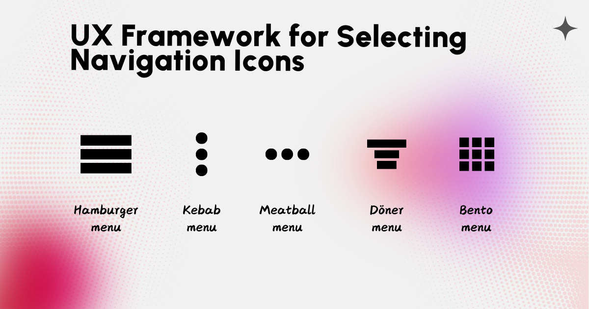
Selecting the right icon isn’t a trivial design decision; it significantly impacts usability, discoverability, and ultimately, conversion rates.
This article aims to explore the UX implications of choosing different navigation icon styles and provide a framework for selecting the optimal icon based on the specific context of your website or application. We’ll move beyond simple aesthetics and delve into the cognitive load, discoverability, and overall user experience associated with each style.
Hamburger menu
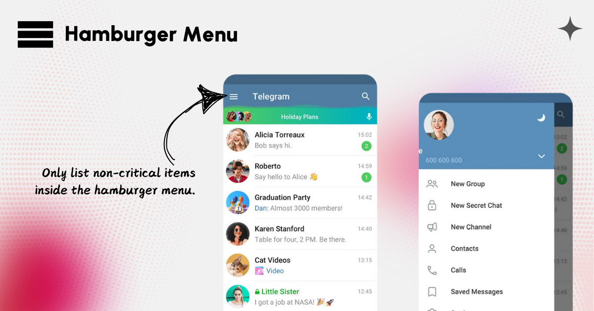
 A hamburger menu is a navigation icon (typically three stacked lines) that opens a side or drawer menu containing links or options. It’s often used in mobile apps to save space and provide access to secondary or less frequently accessed items.
When to use
Use the hamburger menu where the following applies:
- Limited Screen Space: Mobile screens where you need to prioritize space for primary content.
- Secondary Options: When you have secondary features or settings that aren’t essential to the main workflow.
- Consistency Across Platforms: Apps that need a uniform design across iOS, Android, and the web may benefit from a hamburger menu for non-critical actions.
When Not to Use It
Hamburger menu should not be used if the menu includes essential actions, as it could negatively impact usability. Also using a hamburger menu with a large number of items can make the navigation feel overcrowded and difficult to use.
Kebab menu
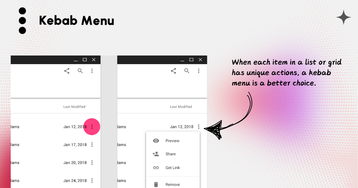
A kebab menu is a vertical three-dot icon used to indicate additional options, often as a secondary actions menu. It’s typically found in contexts where space is limited, such as on cards, lists, or within toolbars in apps and websites.
When to Use It
- Secondary Actions: For actions that are not primary, such as “Edit,” “Delete,” “Share,” or other options related to specific content.
- Avoiding Clutter: When you want to keep the interface clean by hiding less commonly used options.
- Contextual Actions: When each item in a list or grid has unique actions, a kebab menu next to each item allows users to reveal relevant options without overwhelming the UI.
When Not to Use It
- Primary Actions: Avoid hiding frequently used or critical actions behind a kebab menu, as it can hinder accessibility.
- Overuse: If multiple kebab menus are present on a screen, users may find it cumbersome to locate specific actions.
Meatball menu
 A meatball menu is a three-dot icon (⋯) typically used to represent a dropdown or pop-up menu containing additional actions or options related to a specific item.
When to Use It
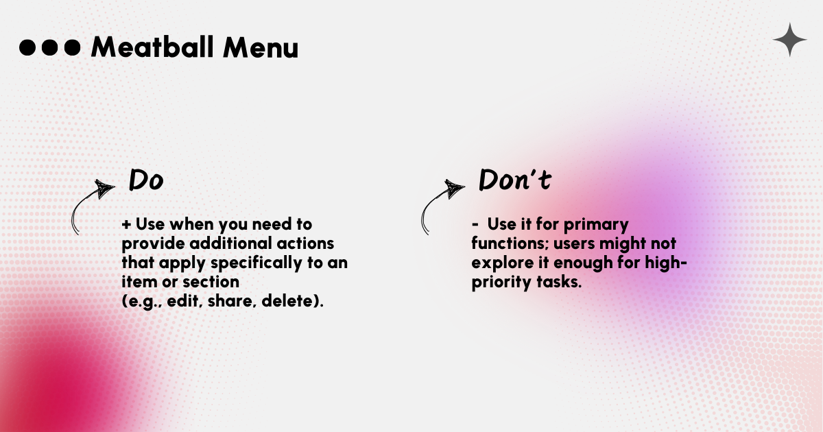
- Contextual Actions: When you need to provide additional actions that apply specifically to an item or section (e.g., edit, share, delete).
- Minimize Clutter: To avoid overwhelming the user with too many visible options.
- Small Screens: On mobile, the meatball menu can keep the interface clean by tucking away less critical functions.
Doner menu
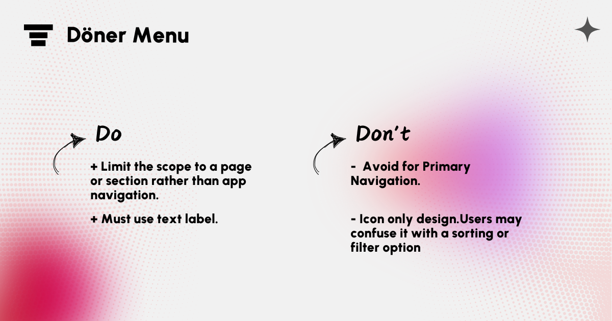
A Döner menu icon, typically shown as a three-dot vertical or horizontal arrangement, is used to open a small menu with additional options. It’s similar to a hamburger menu but is often associated with actions specific to a page or section rather than full app navigation.
When to use it
- Add Text Label: Users may confuse it with a sorting or filter option, so it’s crucial to add a clear label (“More,” “Options,” etc.) when using it as a menu to prevent confusion.
- Best for Contextual Actions: Ideal for contextual actions like “Edit,” “Delete,” or “Share,” usually specific to the current screen or content.
- Avoid for Primary Navigation: It’s less suited for primary app navigation because users may overlook it, thinking it’s a minor or secondary feature.
Bento menu
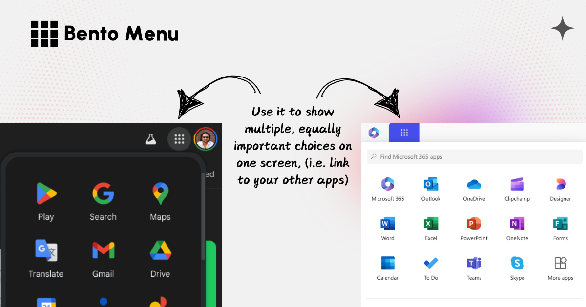
 A bento menu is a grid-based navigation menu that displays several options at once, similar to a Japanese bento box. It’s often used to show multiple, equally important choices on one screen, (i.e. link to your other apps) typically with icons and labels in a grid format.
When to Use It
- Multiple Main Actions: When an app or site has several equally important sections, making it easy for users to access any area quickly.
- Visual Interface: When icons and images enhance clarity, such as in media or shopping apps.
- Reduced Click Depth: When you want users to reach content or features with fewer taps or clicks.
Choosing the Right Icon for Your Design
When selecting the ideal navigation icon for your design, consider several key factors to enhance user experience and visual appeal.
![]()
- Target Audience: Highlight the importance of understanding your user base. Older users might struggle with the hamburger, while younger users may find it familiar.
- Content Complexity: A simple menu with few options can tolerate a hamburger menu, but a complex menu with many options requires clearer alternatives.
- Screen Size & Device: Emphasize responsive design and the adaptive choice of icon styles based on device type and screen real estate. How does the chosen icon impact usability on different screen sizes?
- Branding and Style Guide: The icon should align with the overall visual language of the brand and maintain consistency.
- Accessibility Considerations: Emphasize the necessity of proper labeling (using ARIA attributes for screen readers) regardless of the chosen icon.
- Frequency of Use: Consider how often users will need to access the menu. Frequently used menus should be more visible and easily accessible, while less common options can be tucked away in more compact icons.

